Project: Gourmet Shopping Network Branding Identity
Duration: 2008-2010
Project Description: In this design project we aimed to bring multiple fruit and fruit dessert companies together under one roof – the Gourmet Shopping Network. The concept behind this project was born out of a need to leverage sales through a combined effort. To achieve this, I embarked on creating a brand that exuded an air of gourmet sophistication.
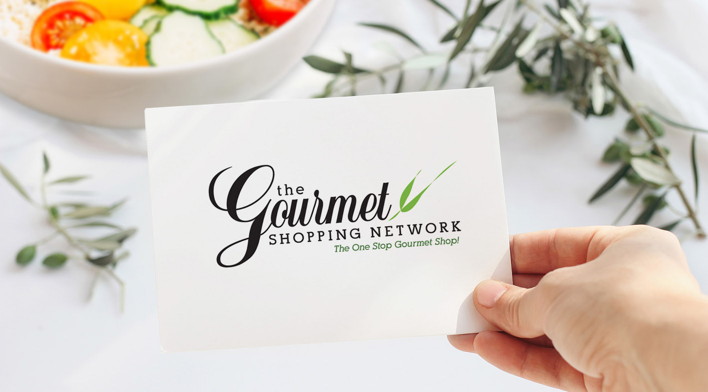
In crafting the visual identity for the Gourmet Shopping Network, I carefully selected elements that would capture attention and evoke a sense of luxury. The centerpiece of the brand was a simple black scripted font with an enlarged "G" in "gourmet." This choice added impact and interest, immediately drawing viewers into the world of gourmet delights.
To balance out the boldness of the script font, I opted for a simple serif font for additional sophistication and elegance. This contrast created visual harmony while ensuring legibility and readability across various platforms.
To add an extra touch of freshness and connection to nature, I incorporated an abstracted green garnish flourishing from the letter "t" in "gourmet." This subtle yet impactful element served as a nod to the natural goodness found within fruits while adding visual intrigue.
Through thoughtful typography choices and strategic use of color and imagery, I successfully created a brand identity for the Gourmet Shopping Network that conveyed its essence as an upscale destination for all things fruity and indulgent.


Project: Brand Identities
Duration: 2008 - 2010
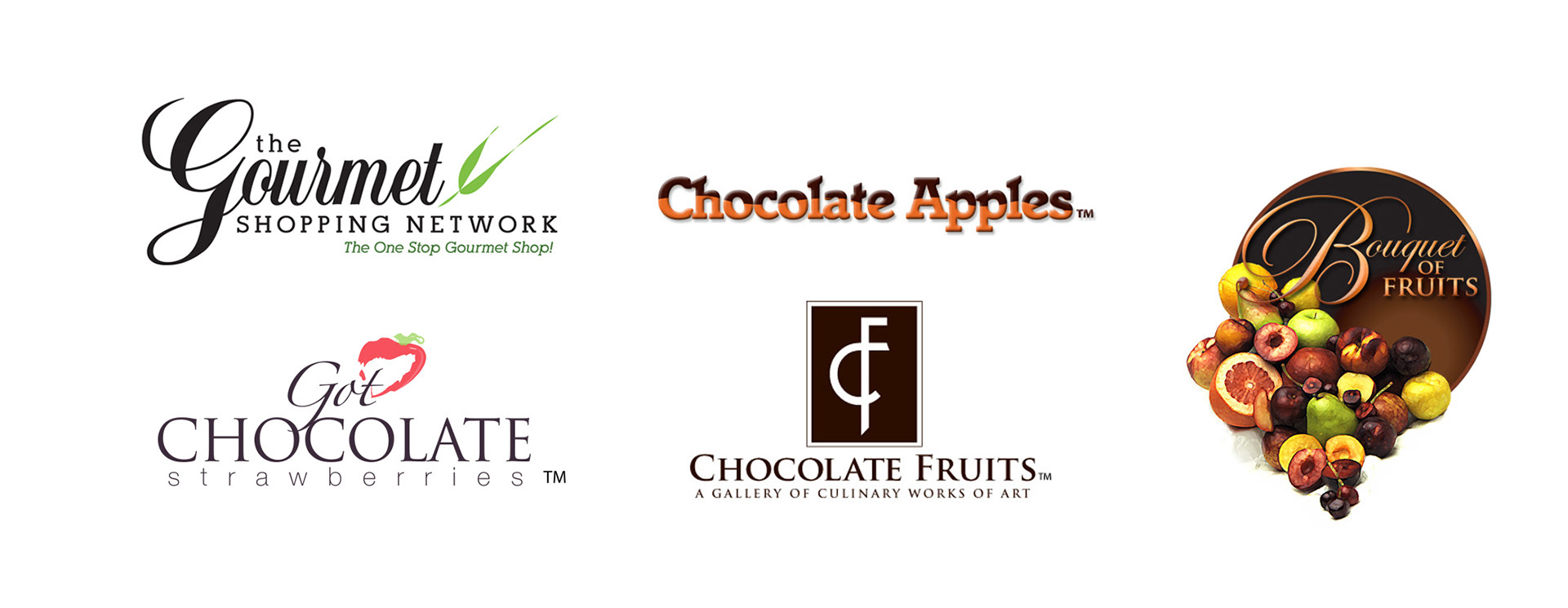
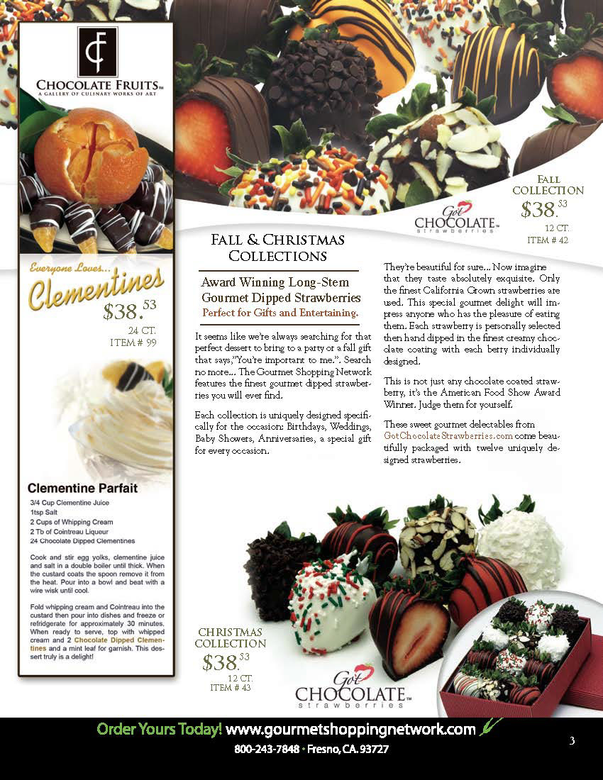
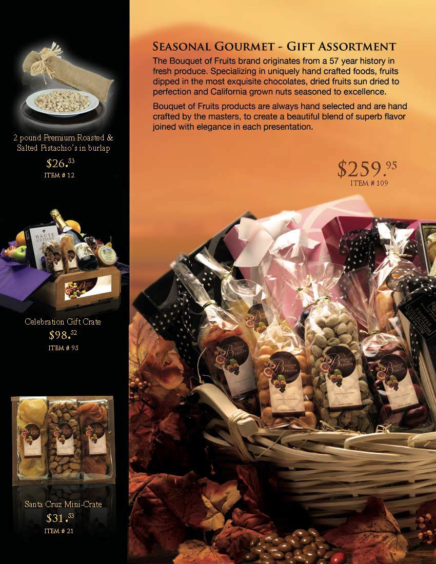
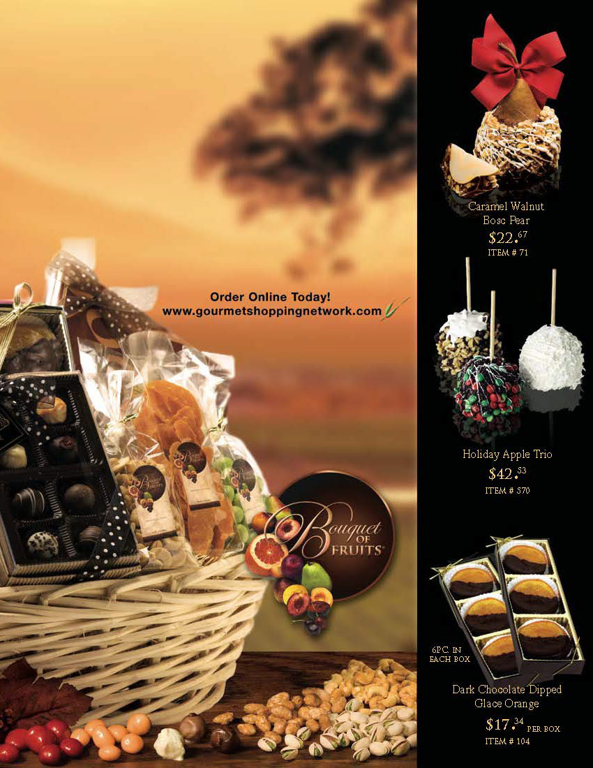
Description: As the network expanded, I had the opportunity to create unique branding identities for each individual business while maintaining a cohesive overall aesthetic. By bringing these diverse entities together, we created a powerful marketing footprint that showcased an array of fruit produce and fruit dessert products.


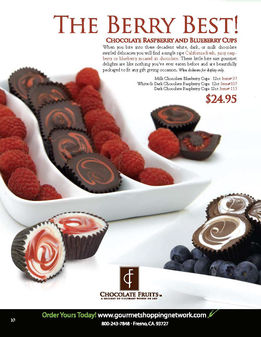

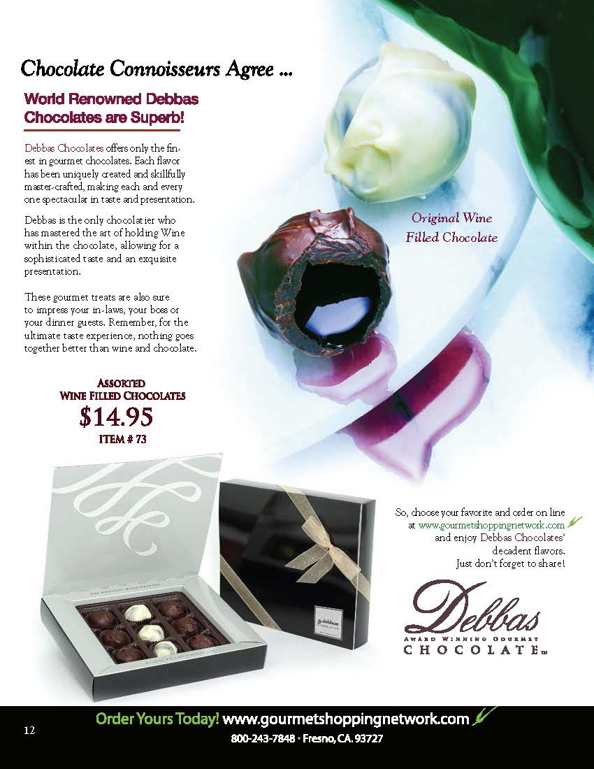
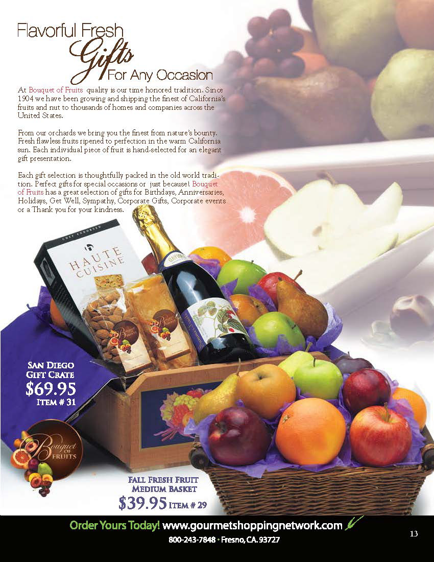

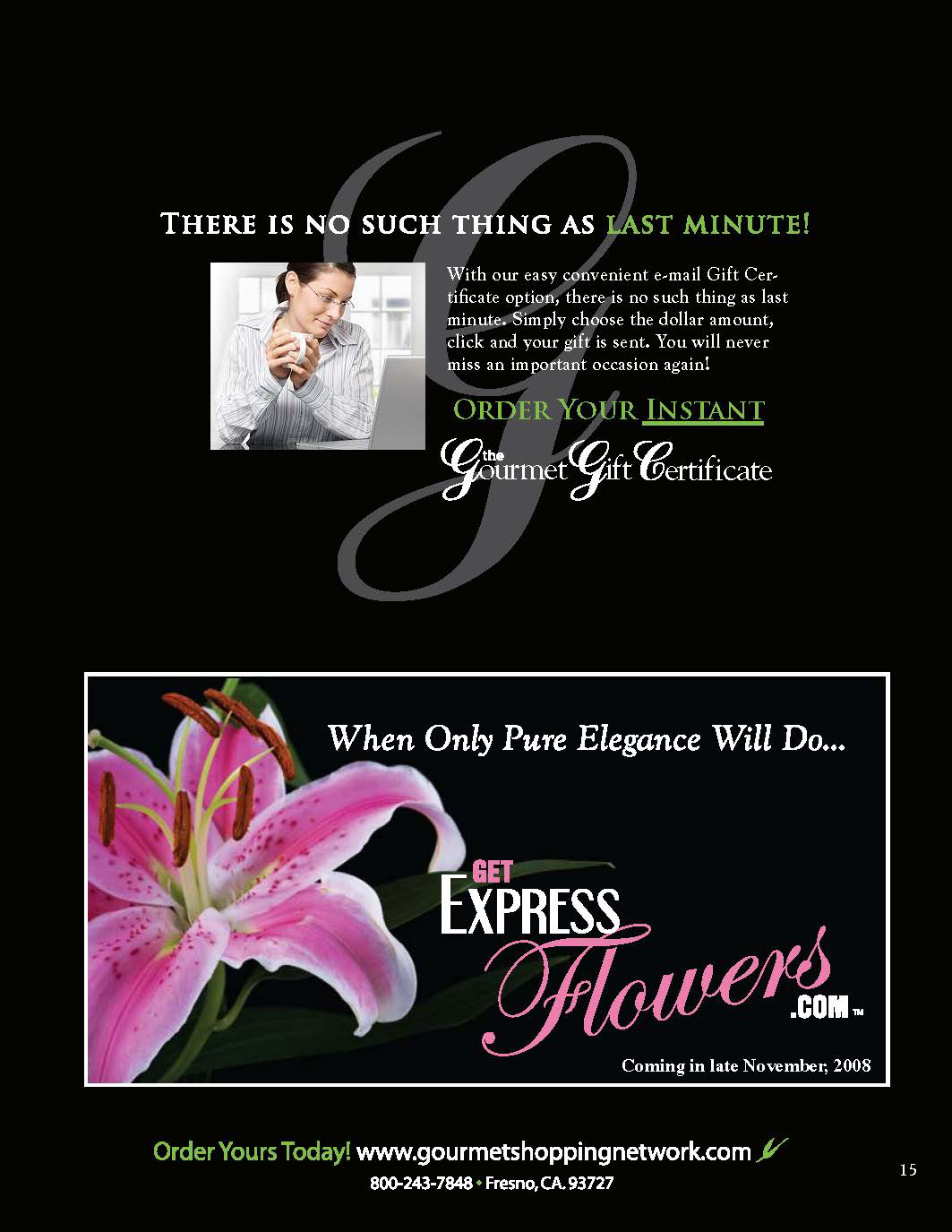
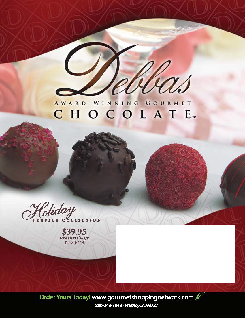
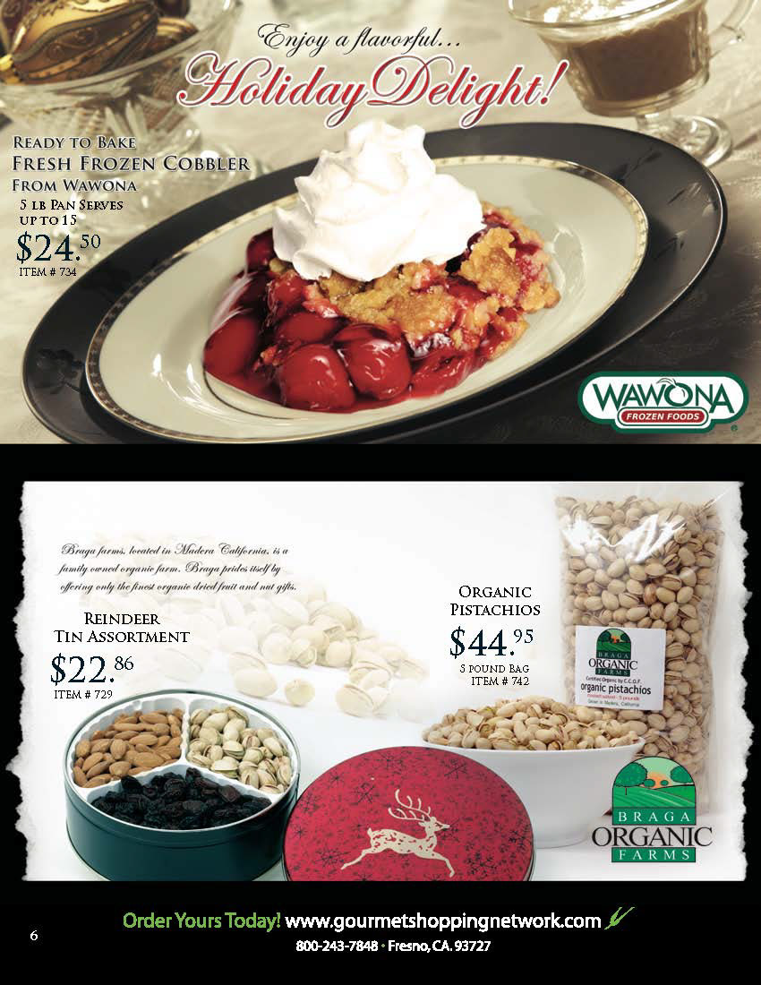
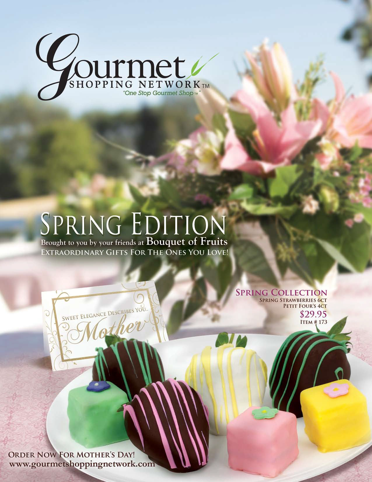


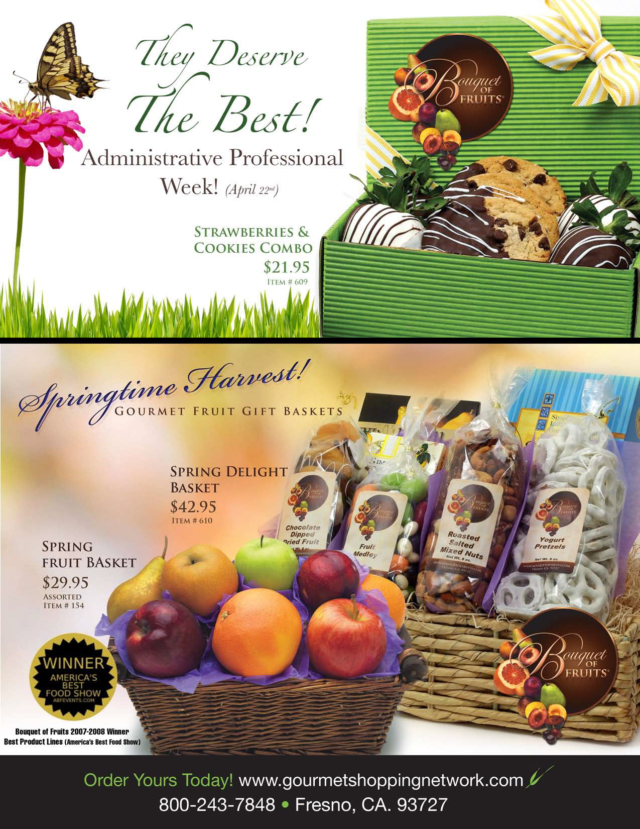
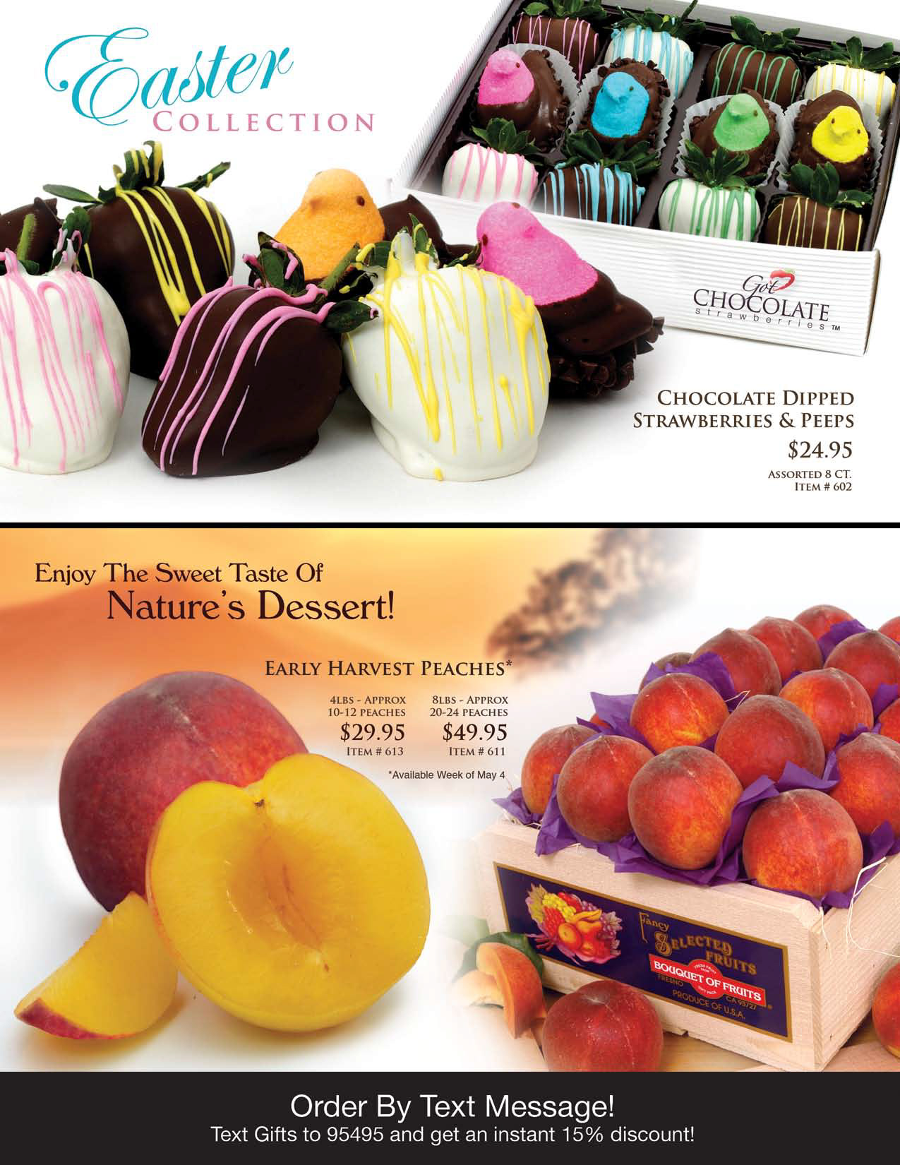


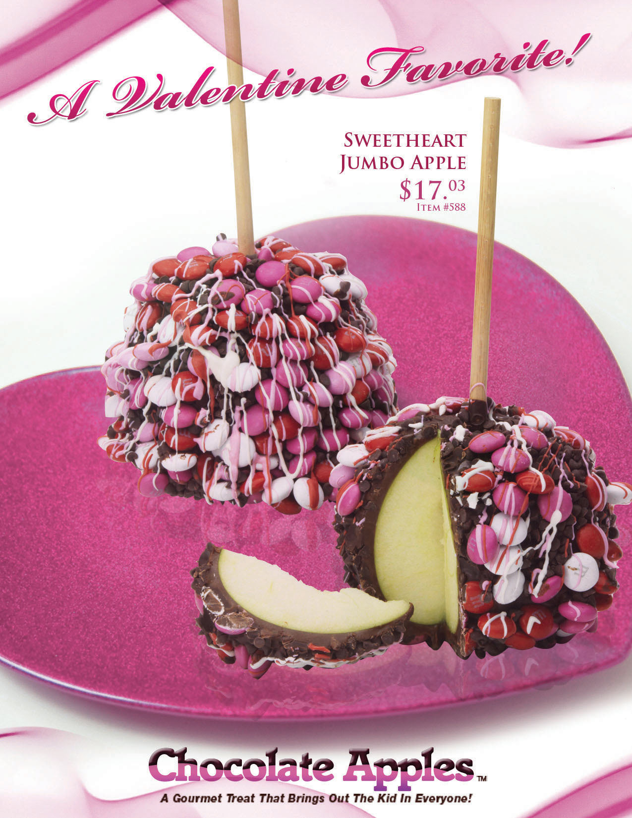
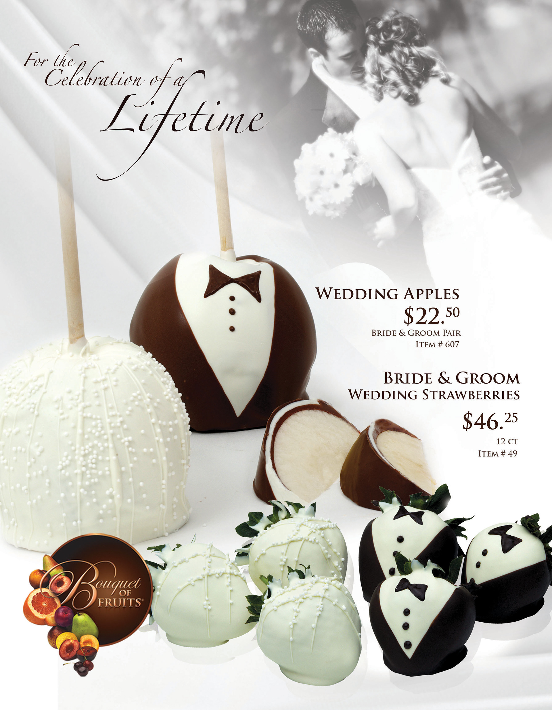
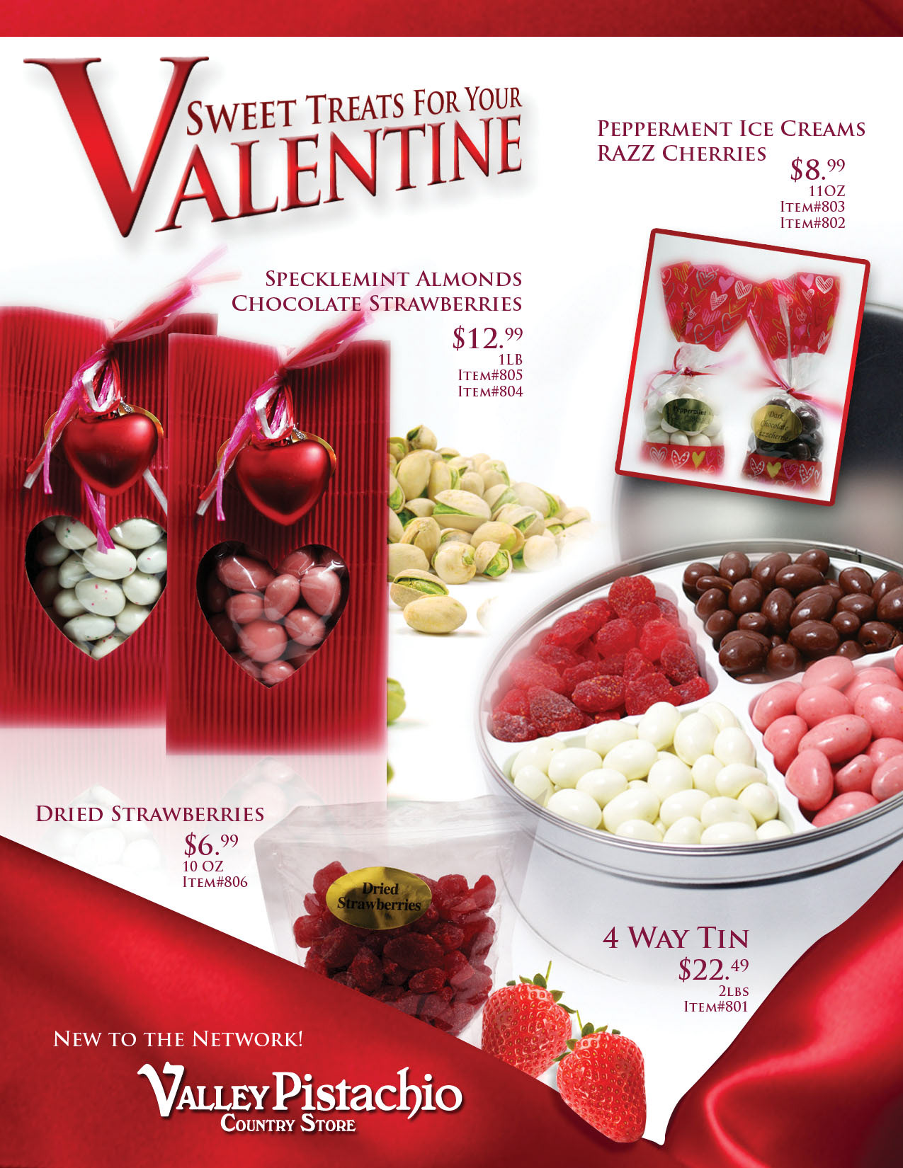
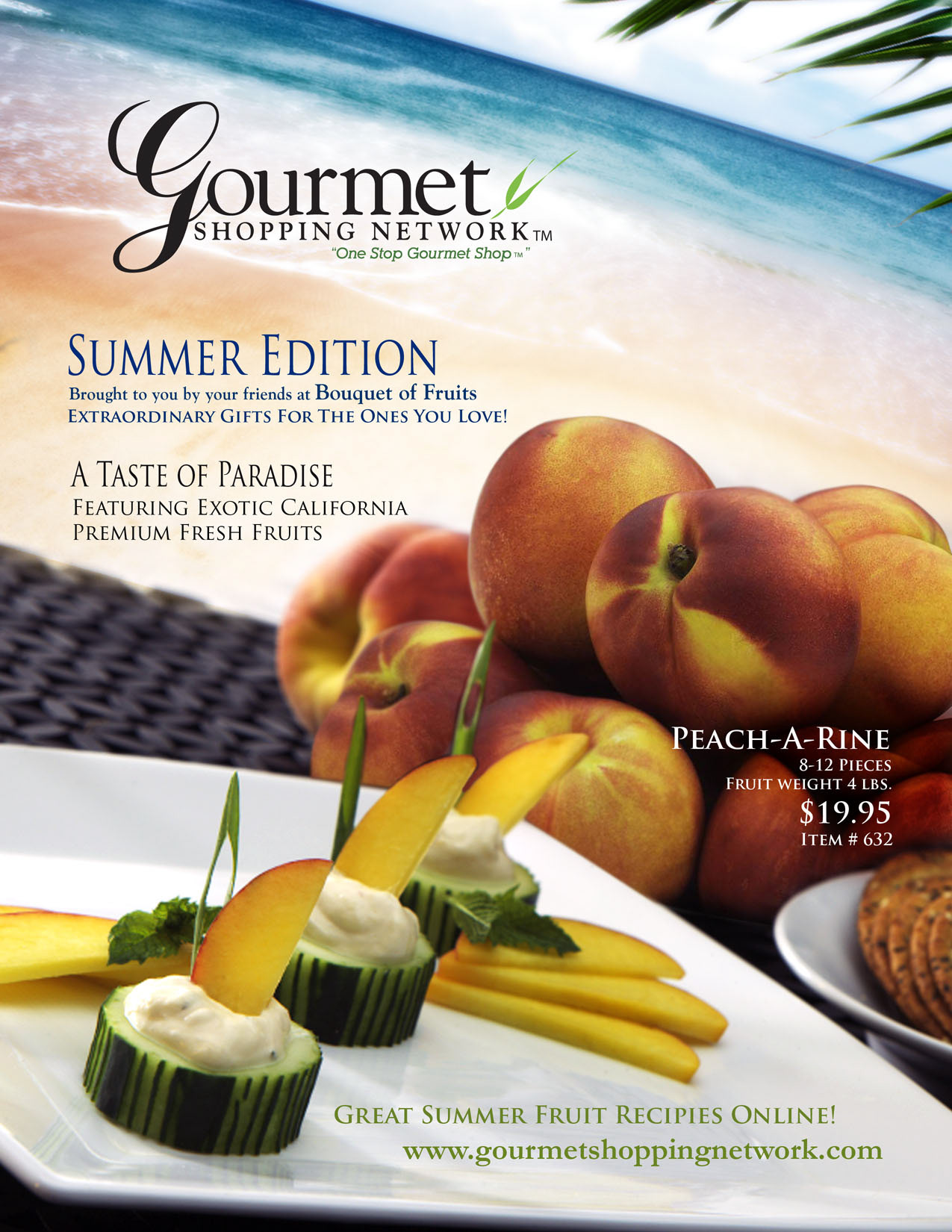
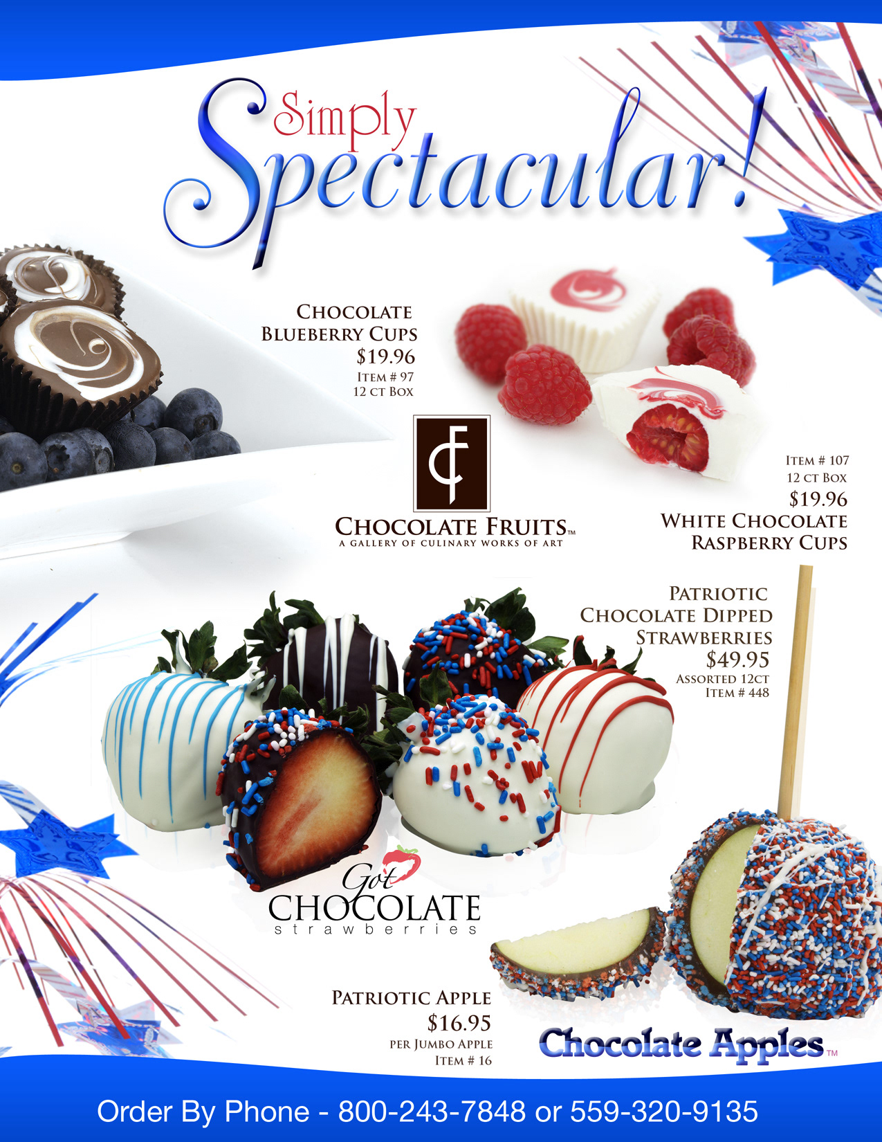
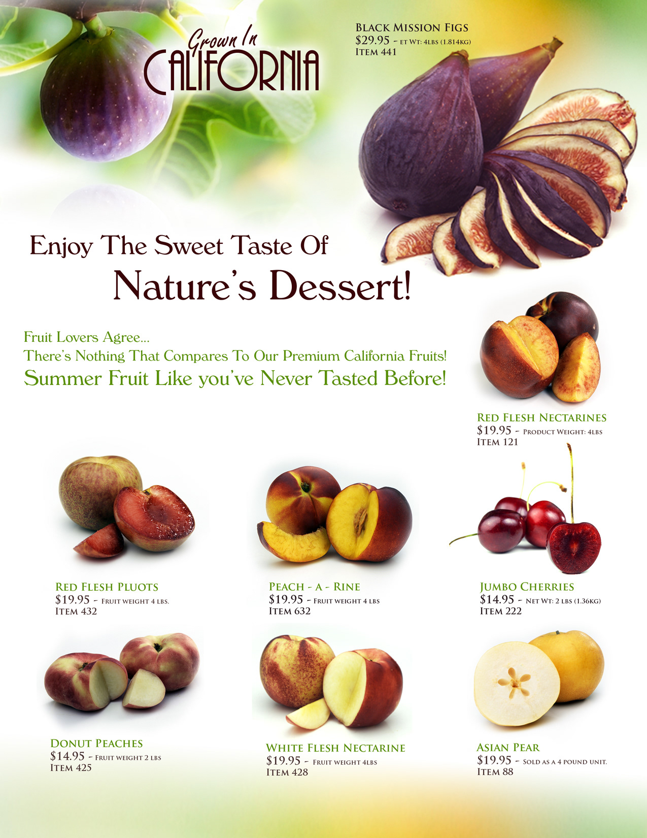

Project: Gourmet Shopping Network Catalogs
Duration: 2008-2010
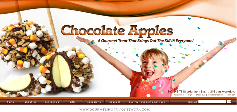
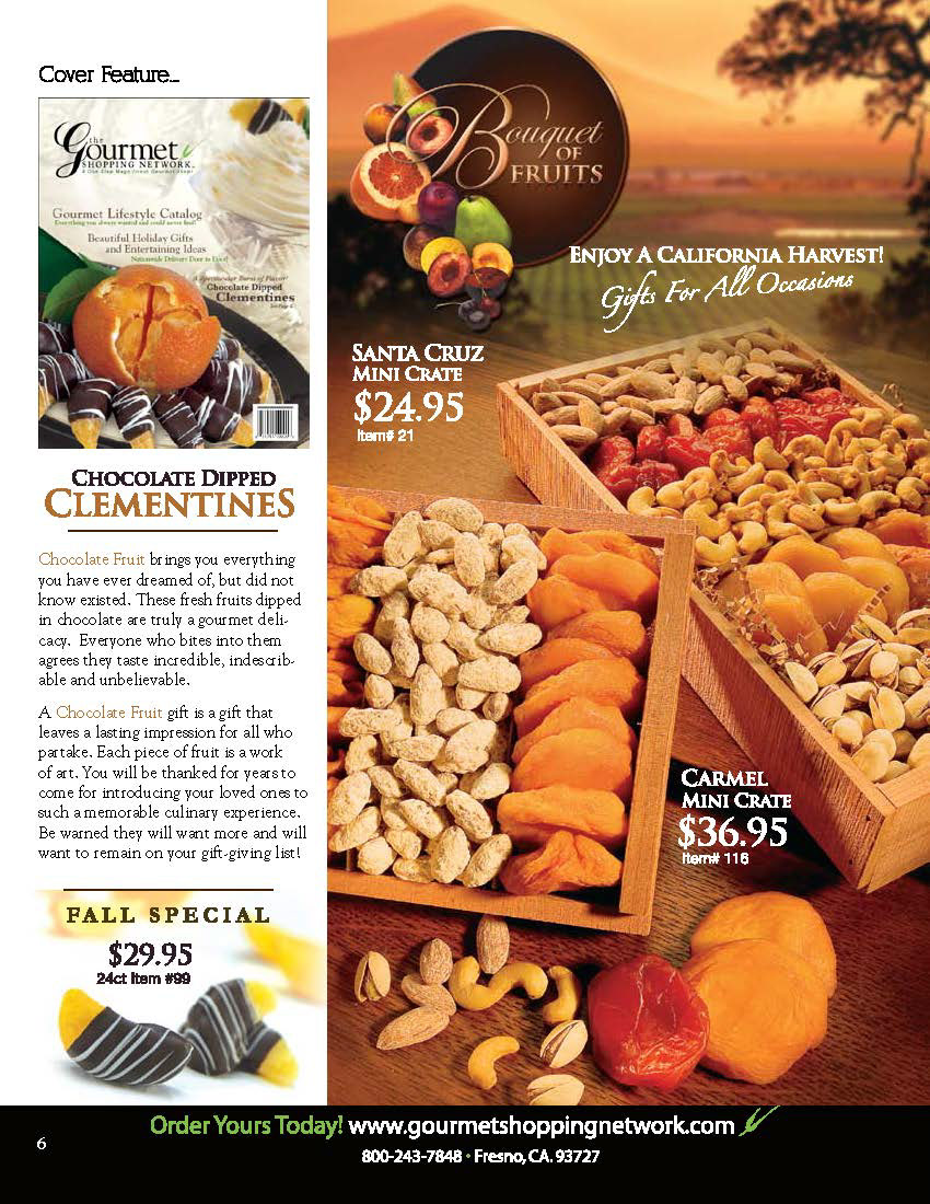
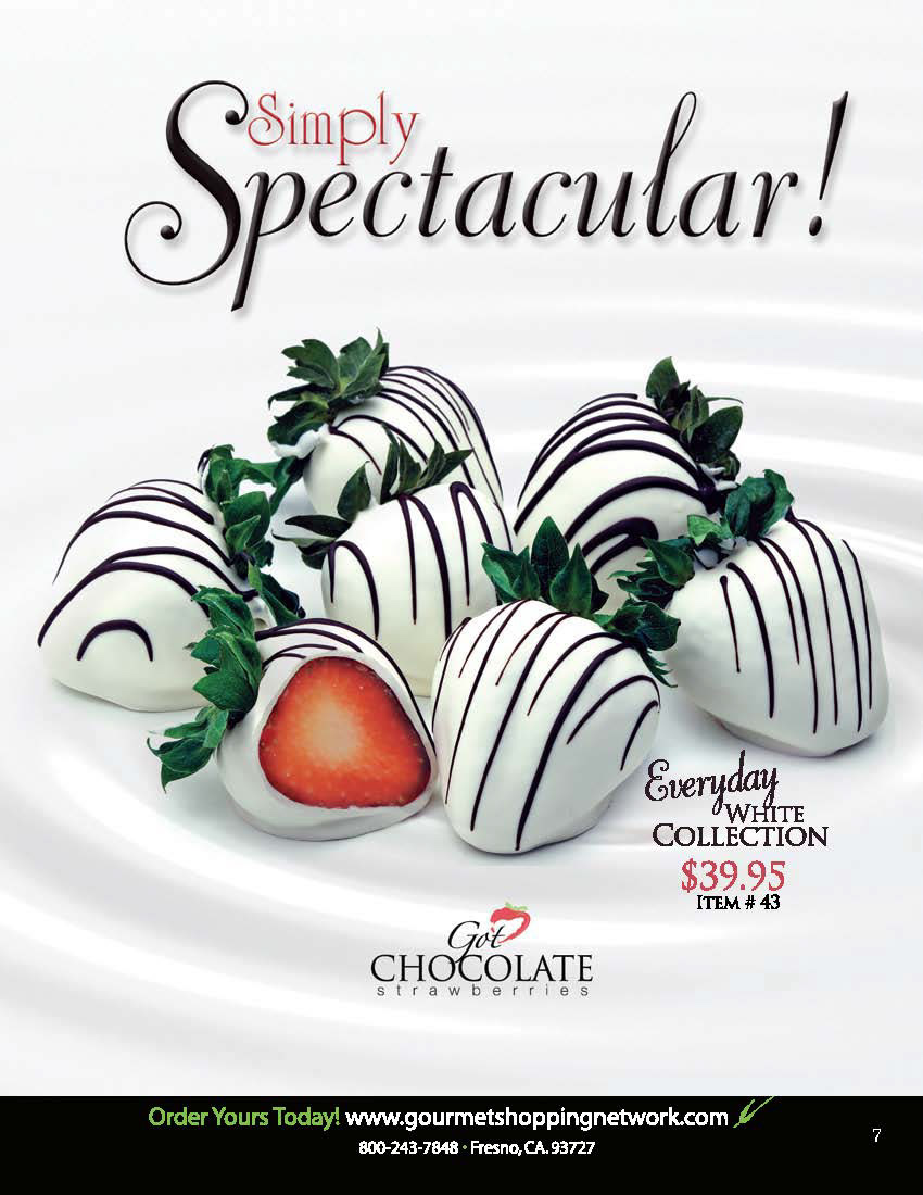
Description: I took on the exciting task of building numerous catalogs from cover to cover. With meticulous attention to detail, I expertly manipulated photography from our exclusive photoshoots. This allowed me to create dynamic magazine-style covers that immediately caught the eye and piqued curiosity.
Moving beyond the covers, I delved into crafting stunning interior layouts. Employing a range of graphic design techniques, lifestyle images, and digital effects, I carefully curated each page.
The goal was clear – to entice customers with catalogs that not only showcased the gourmet products but also evoked a sense of desire and indulgence.
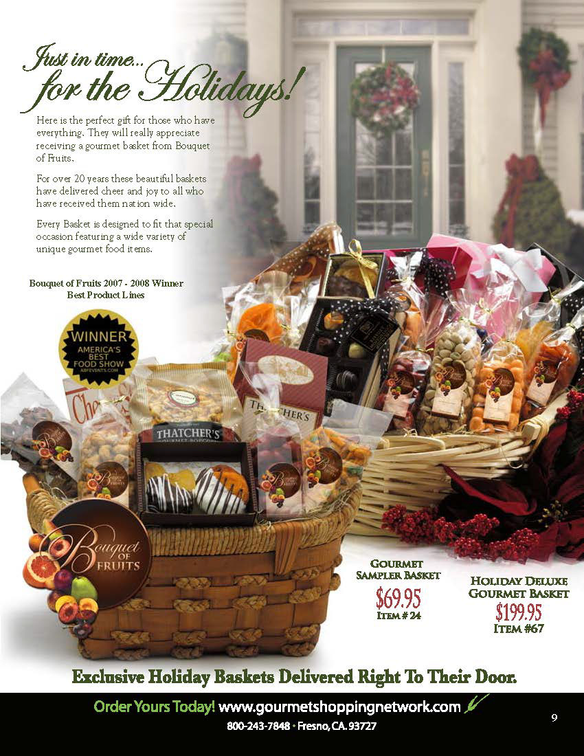
Throughout this process, attention was given not only to aesthetics but also to functionality. The formatting and layout of text were thoughtfully executed in order to draw attention precisely where it mattered most – highlighting important branding messages, prices, and special offerings.
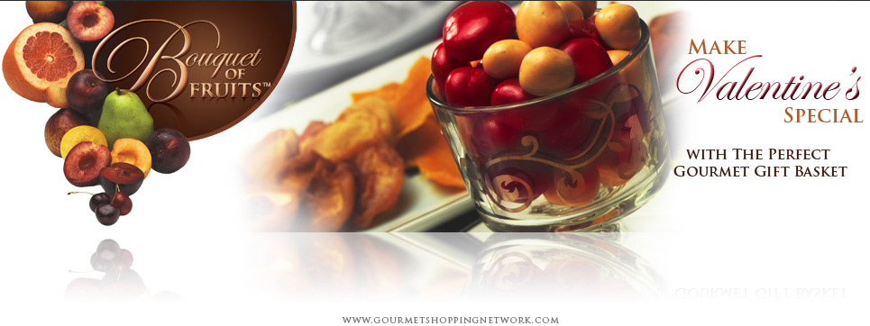
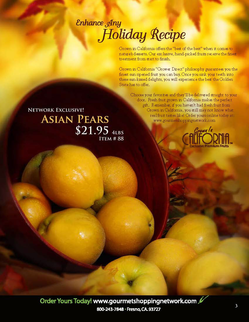
Furthermore, leveraging seasonal holidays became an integral part of our catalog strategy. By incorporating blissful backdrops into our designs during these festive times, we created an enchanting atmosphere for showcasing our gourmet products.
In summary, my involvement in this project encompassed every aspect – from meticulously manipulating photography for captivating covers all the way through crafting stunning interior layouts.